My Custom Darcula Colorful IntelliJ Theme - Years of Refinement
Discover my refined Darcula Colorful IntelliJ theme with enhanced syntax highlighting for Java. Boost readability, reduce eye strain, and download the .icls.
After years of programming, I’ve become quite particular about my development environment. One of the most important aspects is the editor theme - something you stare at for hours every day. Today, I want to share my custom IntelliJ IDEA theme that I’ve been refining over the years: “Darcula Colorful”.
📖 The Origin Story
I honestly can’t remember where I originally got this theme from - it was years ago, possibly from some GitHub repository or IntelliJ plugin. What I do remember is that it started as a base that I’ve been continuously tweaking and improving to match my preferences and workflow needs.
✨ What Makes It Special
The theme is built on top of the classic Darcula theme but with significantly enhanced color coding for better syntax highlighting and code readability.
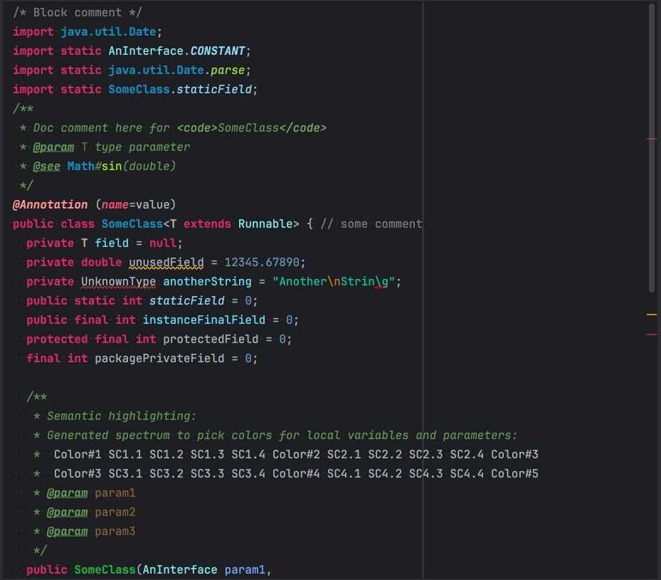
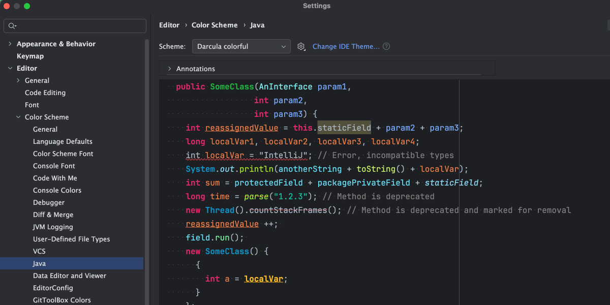
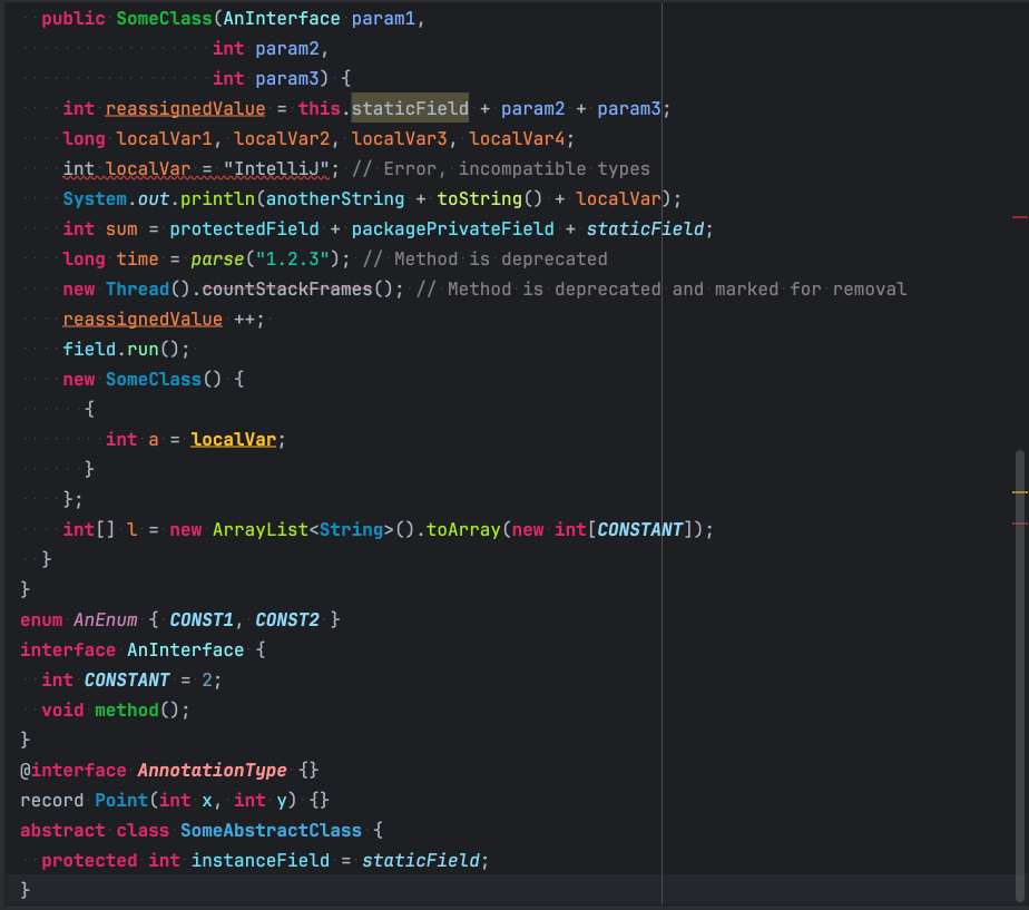 Examples of Java code with the Darcula Colorful theme
Key Features
Enhanced Color Differentiation
- Keywords: Bold magenta (#dd2867) that really pops
- Strings: Teal green (#17c6a3) for easy string identification
- Functions/Methods: Bright green variants for calls (#a7ec21) vs declarations (#1eb540)
- Classes: Blue tones (#1290c3) with bold font weight
- Parameters: Light blue (#79abff) to distinguish from local variables
- Local Variables: Orange (#ed7f48) for clear variable tracking
Semantic Highlighting The theme goes beyond basic syntax coloring with smart semantic highlighting:
- Static fields: Light blue (#8ddaf8) with italic font
- Final fields: Same color but bold italic for constants
- Abstract methods: Light green (#80f6a7)
- Deprecated elements: Red (#ab1f36) with strikethrough
- Unused elements: Yellow underline (#ffbf26) for cleanup hints
Typography Choices
- Font: JetBrains Mono at 16pt for excellent readability
- Line spacing: 1.2 for comfortable reading
- Strategic use of bold and italic to create visual hierarchy
🎨 The Good, The Bad, and The Colorful
Pros
Excellent Code Readability The color choices make it incredibly easy to scan code and quickly identify different elements. The distinction between function calls and declarations, for example, helps when navigating complex codebases.
Reduced Eye Strain The dark background (#1e1f22) with the subtle caret row highlighting (#26272B) creates a comfortable viewing experience during long coding sessions.
Visual Code Structure The bold keywords and varied colors help create a visual structure that makes code blocks and control flow more apparent at a glance.
Great for Java Development The theme really shines with Java code, where the rich type system and object-oriented patterns benefit from the detailed color coding.
Cons
Can Be Overwhelming New users might find the abundance of colors distracting initially. It takes some time to train your eye to use the colors as navigation aids rather than distractions.
Language-Specific Optimization While it works well with most languages, it’s clearly optimized for Java and similar object-oriented languages. Some newer languages or functional programming paradigms might not benefit as much from the color scheme.
High Color Dependence If you’re working on a system with poor color reproduction or have color vision differences, some of the subtle distinctions might be harder to perceive.
🛠️ Installation and Customization
You can download the theme file here: darcula_colorful.icls
Installation Steps
- Download the theme file
- In IntelliJ IDEA, go to
File > Settings > Editor > Color Scheme - Click the gear icon and select
Import Scheme - Choose the downloaded
.iclsfile - Apply and enjoy!
Customization Tips
The beauty of this theme is that it serves as a solid foundation for further customization:
-
Adjust the background: If pure black feels too harsh, try
#2b2b2b -
Modify keyword colors: The magenta might be too bold for some - try
#cc7832for a more subdued look - Tweak font sizes: Scale up or down based on your display and preference
🔄 Evolution Over Time
This theme has been my daily driver for several years now, and I’ve made countless small adjustments:
- Fine-tuned contrast ratios for better readability
- Added SonarLint integration colors for code quality hints
- Adjusted annotation colors to be less intrusive but still informative
- Refined the balance between functional colors and aesthetic appeal
🧠 Final Thoughts
A good editor theme is deeply personal. What works for me might not work for everyone, but I hope sharing my “Darcula Colorful” theme gives other developers either a starting point for their own customizations or simply a new option to try.
The key is to find something that enhances your productivity rather than distracts from it. After years of tweaks, this theme has become second nature to me - the colors guide my eye naturally through code structure and help me spot issues quickly.
Give it a try, and don’t hesitate to modify it to fit your own preferences. That’s how the best tools are born - through continuous refinement and personal adaptation.